I was looking for street scenes to sketch in a little Catskill mountain town. Nothing at eye level inspired me. So I looked up and noticed this false-fronted old building with a utility pole beside it.
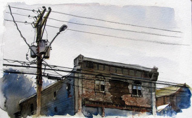
It was a cloudy day, and I wanted it to look bleak, so I used a very limited palette of watercolors and water-soluble colored pencils, just blues and browns.
In order to balance the detail areas of the wires and the texture of the storefront, I kept other areas simple, such as the side of the building and the far trees.

But simple doesn't have to mean flat. Even in a limited palette like this, it's a good idea to look for color movement—the gradual shift from one color to another within an area. In watercolor, that meant wetting an area, preparing burnt sienna and ultramarine puddles on the palette, and then dropping more cool on one side and more warm on the other and letting them blend.
-----
Previously:
90 Degree Rule
Color Gradations


0 comments:
Post a Comment